A new vision for cultural energy
Afrovibes Africa isn’t just a festival. It’s a movement. A monthly rhythm of music, style, energy, and people, rooted in African expression and driven by a generation that knows how to move the culture forward. When they came to MetaCraft to redesign their visual identity, it wasn’t just about “fixing the logo.” They wanted to build something bigger - a scalable, living system that could power their main brand and all the sub-events that live under it.
More than a makeover
Afrovibes had outgrown its original look. What started as pop-up parties had quickly evolved into full-blown festivals, branded partnerships, and multiple signature events. But visually, it didn’t hold up anymore. The brief was simple but bold:
Give Afrovibes a full identity system that’s loud, fresh, African, and modern
Create a visual language that’s flexible enough for sub-brands like Abula Festival, GIG House, ALO, and CommunityFest
Build something that works across merch, screens, tickets, motion, and everything else in-between

Building a language of energy
We didn’t start with moodboards. We started with the culture. From textile patterns and Lagos traffic to Naija beats and Gen Z slang, we were looking for the visual DNA of something alive and unapologetic. We wanted to make something that felt like movement.
We played with rhythm, syncopation, contrast, and color theory, but nothing was done just for vibes. Every detail - from the curves in the logo to the fluid animation in the patterns - was built with intention.

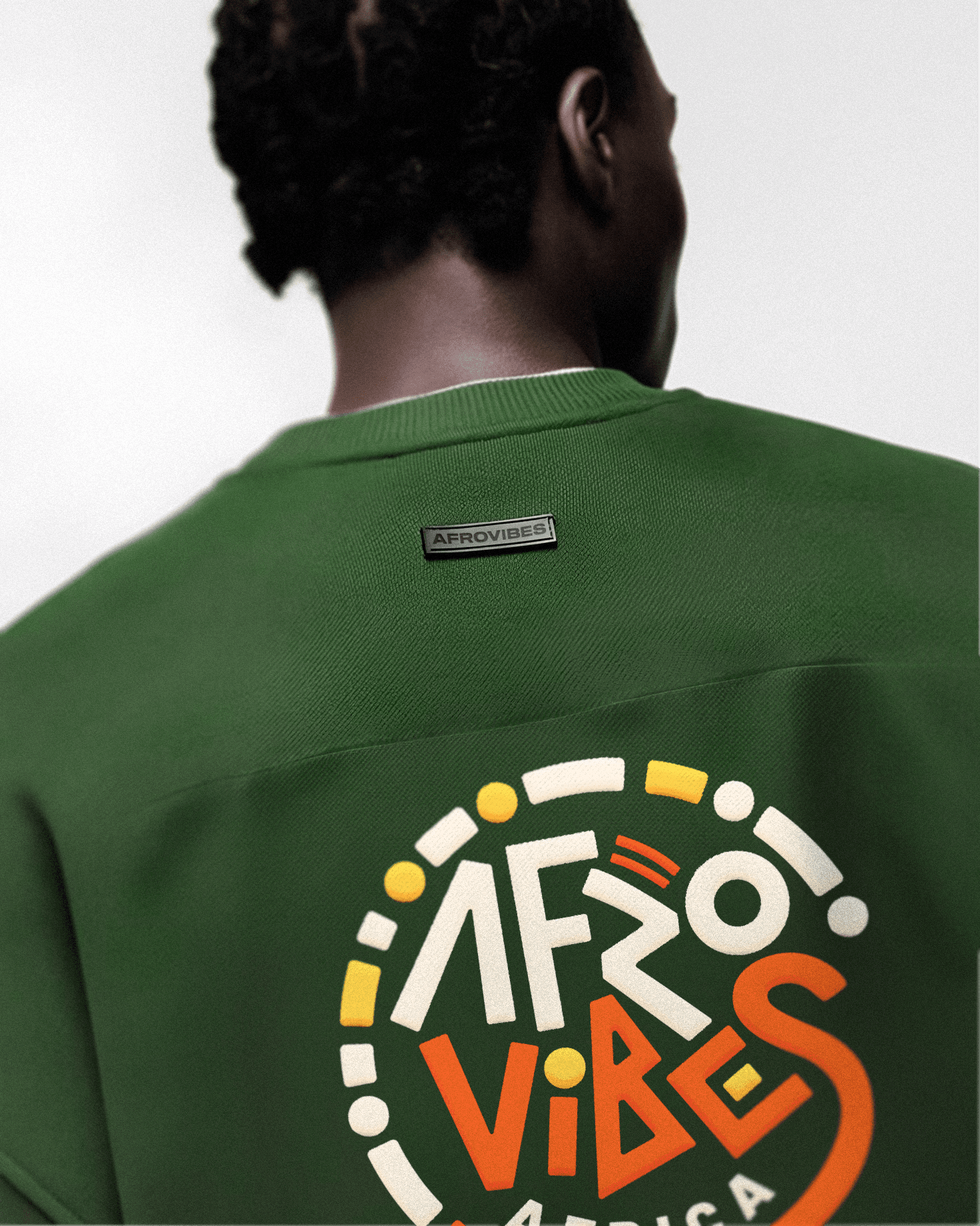
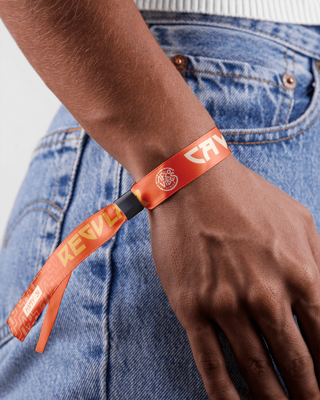
The identity system
1. Logo & Mark
We created a logo that balances clarity with personality. It’s bold and expressive, but simple enough to scale - and it has the flexibility to live alongside event names without feeling secondary.
2. Color System
The palette is hot, grounded, and warm. We mixed terracotta, mustard, deep greens, and carbon tones. The goal wasn’t just to look Afrocentric. We wanted the colors to feel like the weather, the streets, the music.
3. Typography
The fonts are geometric and loud. They’re built to cut through noise on social media and still feel balanced on a t-shirt, banner, or lanyard. No fluff - just sharp, confident energy.
4. Patterns & Motion
This is where the identity really moves. The patterns echo waveforms, street textures, and drumlines. We built motion into the design from the beginning - so whether it's a teaser reel or a stage screen, the brand never sits still.
From screen to street
Once the system was locked, we tested it everywhere - merch, wristbands, screen graphics, info boards, even pop-up pins. It had to work across both commercial touchpoints and gritty, on-ground event experiences.


What happened next
Since we dropped the new identity, Afrovibes has hosted two major events - Black Culture Rave and ALO 2025 - fully branded with the updated visual system. And it showed.
We saw:
Branded screen visuals that lit up the stage
Merch and tags that attendees actually wore proudly
An identity that translated on social, in-person, and in every post-event photo dump
The identity didn’t just look good. It became a tool - to amplify experiences, create continuity, and build deeper audience connection. It gave Afrovibes a recognizable, ownable look that works hard at every event.
The Takeaway
This wasn’t just a design project. It was about giving a growing movement a system that works. Something modular, expressive, and built for scale. The identity feels like Afrovibes and it’s only getting stronger.
See our ongoing work with Afrovibes Africa